
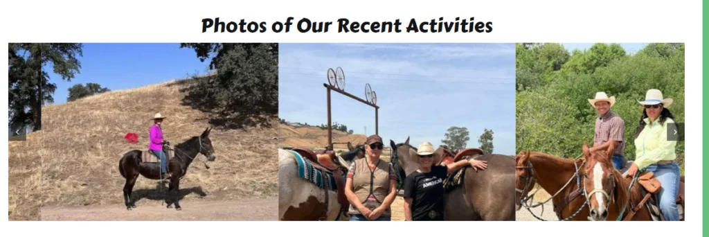
If you love carousels but can’t find that image size that works for you withoiut a lot of time spent getting those images all equal in height so you don’t have to show a tiny thumb image in the Image Carousel Element here is some good news! The below css added to your page css, or use a class if you use global css and don’t want to affect all carousels. This will easily double or even tripple your carousel images!
.fusion-image-carousel-fixed .awb-swiper .fusion-image-wrapper img {
max-height: 300px !important;
width: 400px !important;
height: 300px !important;
object-fit: cover !important;
object-position: top !important;
}
.fusion-image-carousel-1 .swiper-slide {
width: 400px !important;
height: 300px !important;
}
Example is without spaces between the images. This can be adjusted in the element.
To elevate the tabs content it is easy to create content in the library as global. This creates a shortcode to paste into the tab. Lots of customizations can be done this way. Using global shortcode gives control over the content editing in the library.
The select attribute shown in postcards is subject to the width of the input field. To even out the width this css helps.
/* Woo variations table: consistent select widths on postcards */
.fusion-post-card-cart .variations {
width: 100% !important;
table-layout: fixed !important;
}
.fusion-post-card-cart .variations td.value {
width: 100% !important;
}
.fusion-post-card-cart .variations .avada-select-parent,
.fusion-post-card-cart .variations .avada-select-parent select {
width: 100% !important;
max-width: 100% !important;
box-sizing: border-box !important;
}
.small-image .fusion-post-card-image {max-width:70%;}
.small-image .fusion-post-card-image .fusion-image-wrapper > a{
display: block !important;
width: fit-content !important;
margin: 0 auto !important;
}
.small-image .fusion-post-card-image .fusion-image-wrapper > a img{
display: block !important;
}
.fusion-woo-cart .woocommerce-variation {
flex-direction: column;
align-items: center;
}
The legacy Avada Privacy Bar has an awkward appearance on mobile devices. To clean it up and stack buttons this css does the job.
@media only screen and (max-width: 767px) {
.fusion-privacy-bar .fusion-privacy-bar-main {
display: flex;
margin: 0 -15px;
flex-direction: column;
line-height: 1.4em;
}
}
.fusion-privacy-bar-reject.fusion-button.fusion-button-default {margin-top: 10px!important;}
.fusion-privacy-bar .fusion-privacy-bar-main .fusion-privacy-bar-acceptance, .fusion-privacy-bar .fusion-privacy-bar-main>span {
margin-top: 15px;
}
We needed to add a field to a single woo product for the customer to input information. Claudeai had the answer with a mu-plugin.
CSS to style it:
/* RV Length field placeholder – faded color */
.my-custom-text-field input::placeholder { color: #aaa !important; opacity: 1 !important; }
/* RV Length text field – visible border */
.my-custom-text-field input[type=”text”] {
border: 1px solid #aaa !important;
border-radius: 8px !important;
padding: 8px 10px !important;
}
.my-custom-text-field input[type=”text”]:focus {
border-color: #0a12bc !important;
outline: none !important;
}
The mu-plugin:
<?php
/**
- Plugin Name: WooCommerce Product Custom Text Field
- Description: Adds a user-fillable text field to a specific WooCommerce product.
- Version: 1.0
*/
if ( ! defined( ‘ABSPATH’ ) ) {
exit;
}
// =============================================================================
// CONFIGURATION
// Set the product ID and field label here.
// To apply to ALL products remove the ID check in each function.
// =============================================================================
define( ‘MY_CUSTOM_FIELD_PRODUCT_ID’, 1234 ); // <– change to your product ID
define( ‘MY_CUSTOM_FIELD_LABEL’, ‘RV Length’ ); // <– change label as needed
define( ‘MY_CUSTOM_FIELD_PLACEHOLDER’, ‘How long is your RV?’ ); // <– optional placeholder
define( ‘MY_CUSTOM_FIELD_REQUIRED’, true ); // <– set true to make it required
// =============================================================================
// 1. Display the field on the product page
// =============================================================================
add_action( ‘woocommerce_before_add_to_cart_button’, function () {
add_action( ‘woocommerce_after_add_to_cart_form’, function () {
global $product;
if ( (int) $product->get_id() !== MY_CUSTOM_FIELD_PRODUCT_ID ) return;
?>
*
>
<?php
} );
// =============================================================================
// 2. Validate if required
// =============================================================================
add_filter( ‘woocommerce_add_to_cart_validation’, function ( $passed, $product_id ) {
if ( (int) $product_id !== MY_CUSTOM_FIELD_PRODUCT_ID ) return $passed;
if ( ! MY_CUSTOM_FIELD_REQUIRED ) return $passed;
if ( empty( $_POST['my_custom_text'] ) || trim( $_POST['my_custom_text'] ) === '' ) {
    wc_add_notice(
        esc_html( MY_CUSTOM_FIELD_LABEL ) . ' is required.',
        'error'
    );
    return false;
}
return $passed;
}, 10, 2 );
// =============================================================================
// 3. Save the value to the cart item
// =============================================================================
add_filter( ‘woocommerce_add_cart_item_data’, function ( $cart_item_data, $product_id ) {
if ( (int) $product_id !== MY_CUSTOM_FIELD_PRODUCT_ID ) return $cart_item_data;
if ( ! empty( $_POST[‘my_custom_text’] ) ) {
$cart_item_data[‘my_custom_text’] = sanitize_text_field( wp_unslash( $_POST[‘my_custom_text’] ) );
}
return $cart_item_data;
}, 10, 2 );
// =============================================================================
// 4. Display the value in the cart and checkout
// =============================================================================
add_filter( ‘woocommerce_get_item_data’, function ( $data, $cart_item ) {
if ( ! empty( $cart_item[‘my_custom_text’] ) ) {
$data[] = array(
‘name’ => esc_html( MY_CUSTOM_FIELD_LABEL ),
‘value’ => esc_html( $cart_item[‘my_custom_text’] ),
);
}
return $data;
}, 10, 2 );
// =============================================================================
// 5. Save the value to the order line item meta
// =============================================================================
add_action( ‘woocommerce_checkout_create_order_line_item’, function ( $item, $cart_key, $values ) {
if ( ! empty( $values[‘my_custom_text’] ) ) {
$item->add_meta_data(
esc_html( MY_CUSTOM_FIELD_LABEL ),
esc_html( $values[‘my_custom_text’] )
);
}
}, 10, 3 );
We use Avada Builder as our preferred CMS for all the options to customize a design for our clients. Most of the extra plugins we use are the ‘free’ version.
avada.com to see all the options it provides.
Themeforest.net to purchase.
We have tried other builders and even the themes offered through WordPress dashboard. Elementor and Divi are also two good builders. Divi more so than Elementor but that might be because of its similarities to Avada! Both are on the expensive side with subscriptions required compared to the once and done Avada price. Divi does let unlimited usage with its license. Elementor may have a developer license but their pricing page lists up to 3 websites with their higher tier monthly plan.
Alpha testing for Avada 8 is happening now! I am proud to say I have been included in the select group of individuals contributing to this phase.
Avada 8 is a game changer for website developers. I don’t consider myself a ‘power user’ but it will definitely offer power users more opportunities to level up their game!
Hopefully soon the Beta testing will begin. Hopefully there will be news when the final Avada 8 goes live very soon now.
1. Your website’s homepage should communicate your core message clearly and without clutter.
2. We rarely read every word on a website. Most of us quickly scan the page, picking out keywords, sentences and images.
3. Keep in mind these known behaviors to ensure thoughtful content rather than word count.
New tip for using postcards that came up today from Michael C in a Discord message. We use postcards extensively in our builds. Notifying the Avada team there was an issue with how postcards were working and how they now work as a possible bug gave us an unexpected response we are very grateful for!
In previous use the column holding the postcards assigned on a page could be set to flex 1 and the odd postcard in the column would stretch to fill the available space.
Turns out that was a bug and not intentional. Fixing the ‘bug’ causing it for another issue removed the flex 1 on the column allowing the postcard to stretch.
Rather than setting the column holding the postcard on the page, the postcard itself should have the column set to flex 1.
Now it works beautifully again!
This code will trigger the off canvas for a mini cart to replace the limited drop down provided by woo and avada in the menu options. Set up the menu item with menu options for cart icon and badge for quantity. No dropdown cart contents.
Off canvas overlay set to barely visible or transparent. Close on click overlay.
Off Canvas css: .fusion-off-canvas-trigger {
cursor: pointer;
}
trigger class for css in menu and off canvas trigger
.fusion-off-canvas-trigger
Below in the OC code field.
https://gist.github.com/sheweb15/004e345700f5a09c4e4baee822421631
Another css tip for Avada Forms to change the checkbox border color if you don’t intend all the forms inputs to have a dark border:
/*checkbox border*/
.fusion-form-form-wrapper .fusion-form-field .fusion-form-checkbox label:before {
border: 1px solid #000000;
}
.fusion-form-form-wrapper .fusion-form-field .fusion-form-checkbox label:hover::before {
border-color: red !important;
}
/* Checked state */
.fusion-form-form-wrapper .fusion-form-field .fusion-form-checkbox input:checked + label::before {
border-color: green !important;
}
Form Styling css from a Facebook Avada Users Group member Shrzm Rml (formerly Lizza Alli).
Avada Forms checkboxes are really not checkboxes at all! To use a checkmark in the box some additional styling is needed, adjust to your preference for color and sizing:
In addition you can fancy it up with an actual checkmark: Shrzm Rml
shared this css that I have modified a bit:
/*Use custom styles.
1. Add a classname to checkbox field element e.g “my-checkbox”
2. use below styles..*/
.my-checkbox .fusion-form-checkbox label{
padding-left:25px!important;
}
.my-checkbox .fusion-form-checkbox label:before {
height:15px!important;
min-width:15px!important;
}
.my-checkbox .fusion-form-checkbox input:checked+label:after{
left: 5px!important;
top: 2px!important;
width: 5px!important;
height: 15px!important;
background:initial!important;
border: solid #ff0000!important;
border-width: 0 3px 3px 0!important;
transform: rotate(45deg)!important;
}
We use Avada Postcards for showing products, posts and portfolios. There is an included filter function.
The basic filters are a row of text. To dress it up a bit our friend, Stephen Walker, adds a bit of css:
.filtered-cards {
padding:1.8rem 2rem;
}
.filtered-cards .fusion-filters{
margin-bottom:2rem;
}
.fusion-filter {
margin-inline:0;
}
.fusion-filter a{
padding:4px 12px;
color:black!important;
font-size:1rem!important;
font-weight:400!important;
background-color:transpareent;
border:1px solid lightgray;
border-radius:0;
}
.fusion-filter a:hover{
background-color:transparent;
color:black;
}
.fusion-filter.fusion-active a{
border:1px solid lightgray!important;
background-color:rgba(0,0,0,.1);
color:rgb(131, 64, 102)!important;
line-height:inherit;
}
.fusion-filter.fusion-active a:hover{
background-color:transparent;
color:var(–awb-color7)!important;
}
We use Woo with Avada. Sometimes needs a nudge to get the look we like. Woo menu cart is one example where the theme colors need some help!
In Avada Custom CSS we add a hover color to match our theme to that element:
/* Menu Cart Hover Colors */
.fusion-menu-cart .awb-menu__sub-ul_main a:hover {
background-color: #505fa6;
color: #ffffff !important;
}
.awb-menu .fusion-menu-cart-checkout:hover {
background-color: #505fa6;
}
.awb-menu .fusion-menu-cart-checkout:hover a::before {
color: #333333 !important;
}
.fusion-menu-cart .awb-menu__sub-ul_main a:hover::before {
color: #ffffff !important;
}
Lets help Avada with Woo custom checkout align the checkout order review fields and define the radio buttons. Lets also give the radio button a theme matched color.
In the page css:
.fusion-woo-checkout-order-review-tb ul li label:before, .fusion-woo-checkout-payment-tb ul li label:before {
border: 1px solid #000;
}
.fusion-woo-checkout-order-review-tb ul li input:checked+label:after, .fusion-woo-checkout-payment-tb ul li input:checked+label:after {
background: blue;
}
.fusion-woo-checkout-shipping-tb .checkbox span:before, .fusion-woo-checkout-tabs-tb.woo-tabs-titles-disabled .checkbox span:before {
border: 1px solid;
border-color: #000000;
}
.checkout .shop_table tfoot th {
width: 50%;
text-align: left;
}
.checkout .shop_table tfoot td label {
display: block;
}
New to me today!
Title with rotating text set to bounce doesn’t center and linebreak on mobile.
This does the trick.
add to css in title element: rotating-title-mobile
@media only screen and (max-width:800px){
.rotating-title-mobile .fusion-animated-text, .rotating-title-mobile span.line1{
white-space:normal !important;
}}
Desconstructing this prebuilt info page: https://avada.com/blog/avada-online-school-deconstructing-a-prebuilt-website/
The section we want to concentrate on for this discussion is the stacked postcards about half-way down the home page. This appears similar to Full Height container action but not full height of the screen which creates a nice mid page effect.
The desconstruct info from Avada is as follows:
“This section was built using a Container holding one 20% width Column containing a Button Element and an Image Element, one 52% width Column containing a Title Element and a Text Block Element, and one 28% width Column containing a Button Element.
This is followed by two 1/1 (100% width) Columns, where one is used for spacing and the other contains a Post Cards Element.”
More specifically the Post Card Element is set to Stacking. It is important to note here this postcard is set up to display horizontally rather than a vertical or image only design. This works best for the effect of a collapsing container or column when the postcard is set to stack in a 1/1 row as shown in the prebuilt.
There are many designs possible with stacking postcards. Varing columns and content can make for interesting designs.
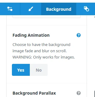
The below information may be outdated with Avada 7.15.2. I noticed when I was setting a container image that there is now a Fading Animation toggle. This allows the background to blur and content over the background to display without blur.
There are some limitations. Parallax can’t be used. Background position doesn’t seem to have any effect.
Want to see some custom effects with Blur on a container or column? Setting blur on a container or column means any element added will also be blurred. We are going to add a container/column below the blurred one and add a negative margin to bring the elements over the blurred image.
This is easy to visualize and follow if you use Live Builder! These examples use containers but apply to columns as well.
Start with a container. Give the container a background image.
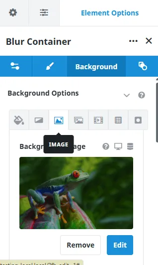
Set container padding to display the image as you wish.
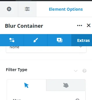
Now apply blur to the container in Extras/Filter Type/Blur. Set the amount of blur to your liking. Don’t forget the hover options as well.
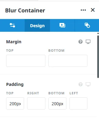
Here is the fun part! Overlapping the Blur Container with a Container/Column with Title and Text elements.
Create a Container with a column below the Blur Container. Use Title and Text elements that will bring your story to life! Or another image, postcard, whatever tickles your fancy. Next set a negative margin on this container. Adjust the negative to get the desired effect.
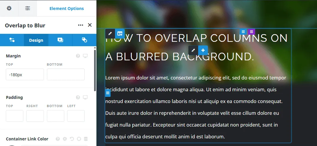
Save and view your finished blur overlap on the front end! Keep in mind you may need to make adjustments for mobile so check the result there as well…
Sub menus with descriptions align center issue. Fix it! (thanks Stephen Walker at Facebook Avada User Group):
.menu-text, span.menu-text.menu-text_with-desc
Provided by Paul Jackson on FB Avada Users Group
Tested and works to center those left over postcards that sit alone in the grid.
If the Postcard column flex grow 1 that stretches those last postcards to fill the column is not what you are looking for you might try this tip. my-center used in the css of the postcard where it is used on the page will center that last row of the grid which doesn't contain a full row.
/* Center Postcard Grid */
.my-center ul
If you want to center all of the postcard grids without using a class each time:
/* Center All Postcard Grids */
.fusion-post-cards .fusion-grid